Lifestyles of the undead

One of my dissertation students turned in a nice paper on the role of graphic design in the health care industry, which was a good choice of topic. It also allowed  for a brief and compelling glimpse into the history of anatomical drawing in the 16th and 17th centuries, a genre that manages to be awesomely whimsical and morbidly realistic by turns. Some of this stuff I’d run across before (usually in the context of samples of copperplate engraving), other examples were totally new to me.

These are culled from both her dissertation and my design history lectures:

Juan Valverde de Amusco, Anatomia Del Corpo Humano. A cadaver gallantly cuts off his own skin to show us the musculature underneath. The anatomical artists of this period liked to show their subjects engaged in goofy, fanciful activities in order to demonstrate a particular angle or aspect of the body.

Andreas Vesalius, De Humani Corporis Fabrica. A great spread, in which the skeleton on the left appears to mull over human mortality while the one on the right seems to be having a full-blown weeping fit. It’s a wonder nobody has yet produced a modern satire/update of this where skeletons are shown in various poses of hipster malaise, tapping on their iPads and naming their children Atticus and Rimbaud.

My favorite from De Humani Corporis Fabrica. One annotation I found claimed that this pose references an expression that saints and Jesus were often shown in, looking upwards to heaven. Whatever. With the spade and Idaho-like surroundings, it really looks to me like an exasperated  ‘Aaaagh, fer cryin’ out loud!‘ gesture. I just love it.

Ok, that was fun. Now for some more gruesome stuff…

Again from De Humani Corporis Fabrica. This time, our lanky friend has been hanged from a rope in order to reveal his esophagus. The thing that looks like a manta ray stuck on the wall to his right? Good news: that’s his abdominal diaphragm, fully removed from his body.

Govard Bidloo, Ontleding Des Menschelyken Lichaams. Hands with disconnected flowing tendons and feet with horrible pokey things stuck through them. I guess you couldn’t properly grasp anatomy without these flourishes? Let’s hope so…

William Hunter, Anatomy of the Human Gravid Uterus. Whoa.

Just to end the post on a more upbeat note…

Fritz Kahn, Der Mensch als Industrieplast (Man as the Industrial Palace). Poster from 1926 visualizing the human digestive system as a chemical factory. Unlike De Humani Corporis Fabrica, this one did get an awesome modern update treatment by Fernando Vicente:

Spite Houses

Just in time for the holidays, I bring tidings of “spite houses,” structures built for the sole purpose of irritating the neighbors (by blocking their access to light and air, etc.).

I have to say — I can imagine something like this happening, but I’m a litle taken aback that this concept is so well-embedded in our culture that there is a commonly-recognized term for it. This wikipedia page contains many examples of “famous” spite houses, including the little bugger pictured to the right. It will also teach you about the less-common, but still spiteful “spite fences.”

The best part about a spite house? Because it isn’t built for any practical use by its owner, there is a lot of leeway when it comes to design — you can really let your imagination soar when the structure you’re building has no intended use beyond to irritate!

More from 'The Book'

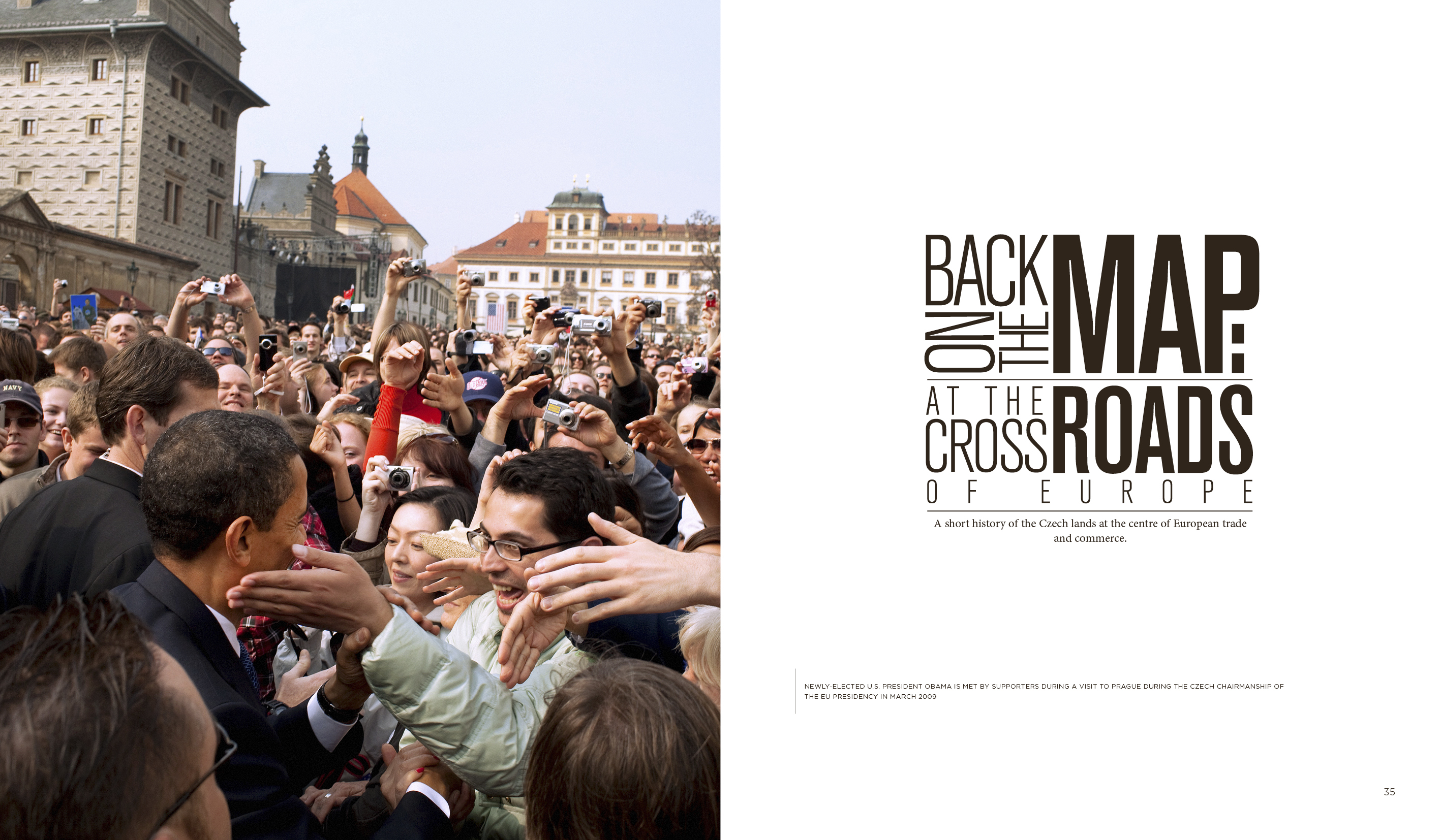
Another batch of spreads below from my just-finished mammoth book project. Previous installment yesterday.

Classic production crisis story: our writer walked away halfway through the project (justifiably, given that the book mushroomed from 120 originally-planned pages to three times that), leaving me and the managing editor, Tom, to cobble together the rest of the copy in a manner that resembled two guys running around a field with flaming beehives on their heads. Also, we were the only native English-speakers on hand to proof it. During the last frantic production push, I spotted a reference to the town ‘Cerhovice’ in western Bohemia on one of the dozen or so maps included in the book. Stupidly, I somehow convinced myself that it’s supposed to be Čerhovice, which sounds more correct to me in Czech (the accent changes the pronunciation to a ‘Ch’ sound). Normally, I would cautiously triple-check any foray into Czech diacritics, but in this case– no doubt due to overall project fatigue– I somehow convinced myself that the ‘Č’ spelling is right, barged ahead and changed it.

Fast-forward to two days later: we’ve sent the final files off the printer and I’m sitting in the car– a quivering mass of frayed nerves– heading towards Austrian Alps R&R with my family. Suddenly, on a highway sign, I spot ‘Cerhovice’. With no little hat accent over the C. Abject panic. I phone the office and reach our production lady who nonchalantly informs me ‘Oh, we caught that last night. Enjoy your vacation.’

(Click on any thumbnail for larger image. All images copyright 2009 Dept. of Design.)

Done

The first copies of the CTP Yearbook (the project I’ve been ominously referring to as ‘The Book’ in this blog) came back from the printer on Friday night. This is the 360+ page book that I’ve been working on since April for an industrial developer and wound up designing every last millimeter of. For perspective’s sake, I’ve been working on the book since before my son was born and since before I started this blog. My two immediate reactions to seeing the printed version (above) is ‘Jesus, it looks like a phone book!’ and ‘Wow, the paper we chose really helps’– we used a heavy kind of rough paper which makes the colors look dark and saturated and helps fend off any unwanted cheesy corporate sheen.

I wanted to show photos of the actual physical book, but the intensely bright lamp we use here for product shots literally caught on fire a few minutes after I turned it on (at least, a horrifyingly noxious smoke started rising from it). Also, the book is so big that it’s almost impossible to pull open in a way where you can get a nice even shot, unless you have several minions helping you to tug it open. So, these are from the digital files we sent off to the printer instead….

(Click on any thumbnail for larger image. All images copyright 2009 Dept. of Design.)

I’ll post another batch of spreads tomorrow.

Mad Men and Doyle Dane Bernbach

Believe it or not, I’ve just started watching Mad Men. I’m all the way back at Season 1, Episode 4– so far behind that I can read TK’s posts on the current episodes without spoiling anything for myself as the plot has moved on to completely alien terrain from what I’m familiar with.

I was delighted to see Episode 3 open with Don Draper looking at the Volkswagen ‘Think Small’ ad— a campaign that changed advertising to the degree that I show it to my graphic design history students— and thought that the campaign was cleverly used in the episode to amplify some of the larger points of the show. I should hedge this last comment by saying that I haven’t really seen enough of the show to weigh in authoritatively yet on what the larger themes of the show actually are, but so far I take it as a snapshot of the last days of trying to have a top-down, hierarchical society in America before pluralism stepped in and turned everything on its head. If you accept that as an underlying theme of Mad Men, you can definitely say that the appearance of Doyle Dane Bernbach– the agency behind the VW campaign– marked a tipping point in the real-life narrative.

Doyle Dane Bernbach opened its doors in 1949 and became known for its determination to ‘take the exclamation point out of advertising’– meaning, among other things, less nuptial script, grinning Stepford wives and long-winded copy stuffed full with promises (1940s ads were really, really long on copy). By the early 1960s, removing the exclamation point had become imperative: the murmurs of a civil rights movement and engagement in Vietnam increased the public’s appetite for real reportage and decreased its tolerance for Eisenhower-era fluff. TV revenues, meanwhile, had cut into magazine revenues to the point that budgets and physical formats were smaller, meaning the exclamation points couldn’t ever be as large or glamorous again as they had been in the past. Finally, I imagine that TV, by the nature of its very medium, probably inspired a move towards intelligent advertising: in print, you can keep making the same corny over-promises over and over again and never get called on it. But, in the world of TV, you have to have an actual live person making these claims (‘gum that cleans and straightens your teeth!’). I’m guessing that the humiliation gleaned from this experience- for all parties involved- partly inspired a move towards more intelligent advertising on some psychological level.

DDB was the first agency of note to try selling stuff by leveling with the audience and appealing to its intelligence. The ‘Think Small’ ad spoke directly to a potential product liability and used a white space in a surprising way to stand apart from the crowd:

Subsequent ads in the campaign– which I just noticed was voted best of the century by something called AdAge.com– included the car with a caption ‘Lemon’:

… and a play on the homeliness of the lunar module:

I loved the verdict delivered in the Mad Men episode, where all the characters basically dump on it (‘They only used a half-page ad for a full-page buy… you can’t even see the product!’) but then Draper points out, ‘Love it or hate it, we’ve been talking about it now for 20 minutes’.

The corporate structure in Mad Men was also typical of most ad agencies of the day: as is shown several times in the first few episodes, account execs and writers develop the concept, then hand it off to the art department which is responsible for bringing it to life without any creative input. Again: top-down, hierarchical. DDB pioneered what became known as the ‘creative revolution’, where project teams including an art director and writer would brainstorm together to develop the idea, effectively forcing a synergistic relationship between word and image.

My favorite DDB campaign is one they did for Levy’s, an account they had held for several years without highlighting the ethnic angle until this poster appeared in subways in 1961:

Update: for serious type nerds, reader MM passes on this typo analysis of Mad Men from Mark Simonson’s blog.

Czech Mex

A rejected directional sketch I did for our client who’s selling burritos in Prague:

czech_mex4

For such an indispensable and delicious foodstuff, the burrito sure is a difficult thing to make look good. It often winds up looking like an amorphous blob when illustrated and downright repulsive when photographed. There’s a real need in this project, moreover, to show it in a way that’s both appetizing and readily identifiable, as lots of central Europeans are somewhat fuzzy on the whole concept. We discovered that my fellow designer here at the studio, a Ukranian fellow, had no idea whatsoever what they’re about.

I kinda like this pseudo-woodcut look, but we collectively resolved to go in a more diagrammatic ‘Tech Mex’ direction, which is fine with me. I would happily sign the rights to this over to anyone who would overnight FedEx me a Mission burrito in exchange. All this burrito-related design work is making me really hungry.

So-called Information Superhighway

A few nights ago, the wife and I got some take-away food from the corner restaurant, Neklid (‘Turmoil’). I got my favorite dish: a steak cooked in pepper sauce with green beans wrapped in bacon and roast potatoes also cooked with bits of bacon. It’s like bowling a strike every time. Unfortunately, it also has a clearly-documented history of causing me to wake up in the middle of the night if I have it too late in the evening. This creates a sort of ongoing metaphysical dialogue where my 3am self is continually reminding my hungry, 7pm self not to order it, but the latter often manages to persuade himself that somehow the usual insomnia scenario isn’t going to apply this time. Long story short, I was up in the middle of the night. To complete the woeful vignette, you have to picture that I had also tweaked my neck while working long hours on The Book, so I was lying in bed with one of those dorky foam neck cushion things people take on airplanes, sleeplessly pondering my own gluttony.

For whatever reason, my mind wandered to the joke phrase ‘the interwebs’ that everyone started using at some point. When did it start? Was it inspired by George W. Bush’s bizarre formulation during the 2004 Presidential Debate when he mentioned ‘the internets‘? Or is it just another case of parallel evolution where a joke phrase began to emerge in the public consciousness at the same time that the same phrase emerged as a serious concept in the addled mind of our former president?

I always feel that the phrase ‘Information Superhighway’ has never really gotten its deserved share of mockery, in part because it’s always overlooked in favor of ‘interwebs’. It’s definitely my preferred ironic internet moniker, though, not least because it was originally intended seriously and was thought to sound cool. Along with ‘cybercafe’ and ‘educational CD-ROM’, it’s the disused phrase that perfectly summarizes the wide-eyed, mid-1990s utopian expectations of the internet, which – as we now know- has for better or for worse thoroughly insinuated itself into our lives as a comparatively banal, functional convenience.

Do a google image search for ‘information superhighway’ and you get an entertaining visual moodboard of all these clichéd 90s internet concepts: streaking circuitry, shopping carts, network cables and, of course, highway metaphors:

dco0059_-_information_superhighway_low-res-1024x682

As visual messages, these have about as much going for them as animated unicorn gifs. What’s puzzling and disappointing is why the 90s visualizations of an internet-ty future didn’t result in anywhere near the same imaginative yield that came out of, for example, the early machine age or the early days of space travel. One can make the case that modern art as a whole- starting with cubism in the late 1910s- began as a collective visual attempt to reckon with the new sense of space and time that machines imposed on people. Subsequent design movements such as Futurism and Vorticism created an entire abstract visual language out of their self-professed fascination with new technology. Meanwhile, 1950s visualizations of Jetsons-style space colonization may seem fairly kitschy and silly to us now, but at least they involved considerable flights of fancy. By comparison, the visual language adopted to describe the early days of the web is all so literal, po-faced and lame by comparison. I suppose part of this is the fact that there was money to be made from the beginning in couching something abstract (‘internet’) in tangible terms (‘highway’) and thereby getting people comfortable with the idea of buying goods on it. And that there was a kind of corporate incursion on the internet from the very beginning. But, still, it’s hard to figure out how we could have gone so wrong with this from the start.

Short attention span theater

tm

One of the things I like about design is that you wind up doing a lot of different types of work for a lot of different clients. In this sense, the job acts as a kind of zany docent of the world, leading you into various different realms of human enterprise and giving you fleeting examples of the types of people, attitudes, jargon, attitudes, attire etc. that populate each. One week, you’re doing a project for a box factory; the next week, a clown college; and so on. This is nice gimmick in terms of incorporating a constant (if superficial) level of variety to the job… you’re never exactly doing the same thing every day (unless you decide take a job for that box factory as their creative director, in which case you most definitely are).

One memorable realization of this perk happened for me in March of 2005, when I was working with a studio that had taken on an identity and packaging job for a new line of soaps and scrubs to be called Pomegranate Body. On our first day of work, I was sent off on my bike with a camera and two tasks: (1) buy a real pomegranate; (2) take photos of competing bath and body products in the nearby branch of Sephora, the hideous chain cosmetics store. Task 1 proved to be absolutely impossible in the middle of March (apparently the antithesis of pomegranate season); task 2 became imperiled when a beefy security guy told me that it’s prohibited to take product photos in Sephora stores. Being a somewhat lazy and passive person, I’m generally inclined to comply with such orders, but in this specific case is struck me that I had no need to go back to Sephora for the rest of my life, and that I had a very real and substantial need to get product shots. So, I continued taking photos for a few minutes in surreptitious ‘spy mode’, nonchalantly snapping very poor, blurry shots while keeping the camera out of eyeshot and pretending to be conscientiously shopping. Inevitably,  the security guy caught on and marched me (firmly, but civilly, I must say) out of the store to the curiosity of other patrons. Once I jumped on my bike, it occurred to me that I’d spent an few hours ‘on the clock’ shopping for a nonexistent fruit of ill-repute and getting thrown out of a perfume store. Beats workin’!

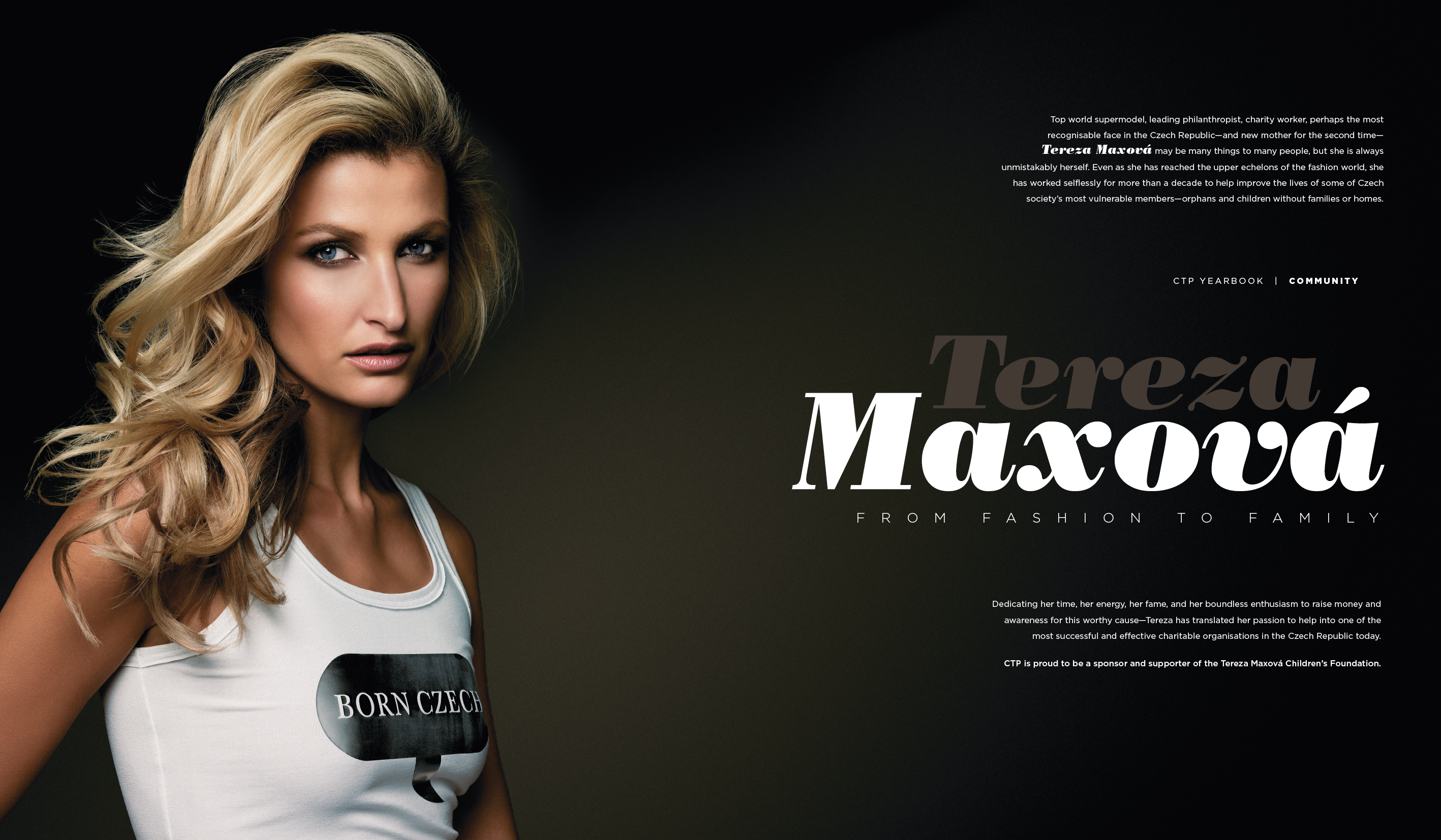
From time to time, my experiences give me a renewed appreciation for these random, short-attention-span-theater aspects of the designer’s job. Consider the juxtaposition of meetings I’ve had in the last 24 hours: yesterday, a middle-aged Chinese couple who market canned pork products to Central European countries; today, former supermodel Tereza Maxova’s charity foundation. Vive la difference!

(Photo credit: Tereza Maxova, by Flickr user Neon / 24)