The Girl In The Abstract Bed and other finds

OK, I’ve never blogged the ongoing process of working on a project before and so I have no idea whether it’s interesting, illuminating, unseemly or just dead boring (or some heady concoction of all of the above). In any case, I promise this is the last image dump I’ll do on the Legs of Izolda Morgan project for awhile. If I post on the subject again, it will be to show new designs.

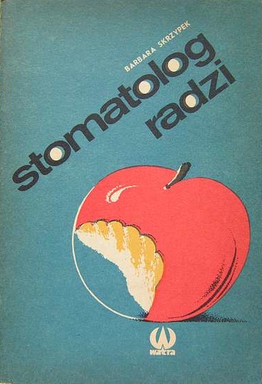
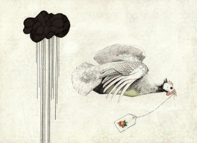
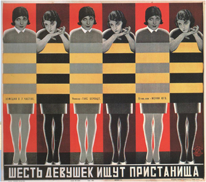
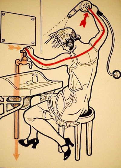
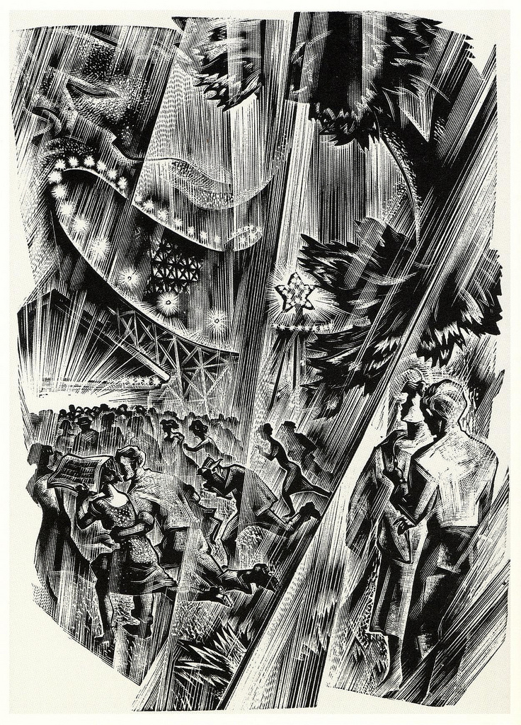
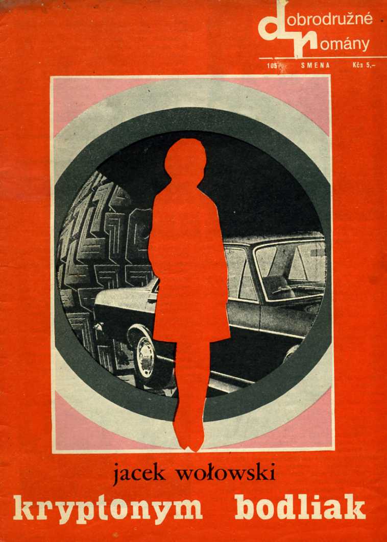
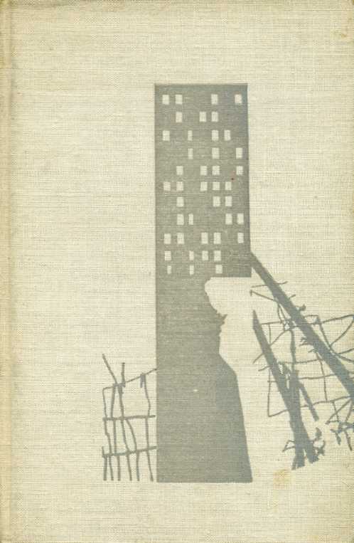
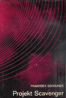
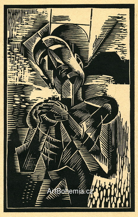
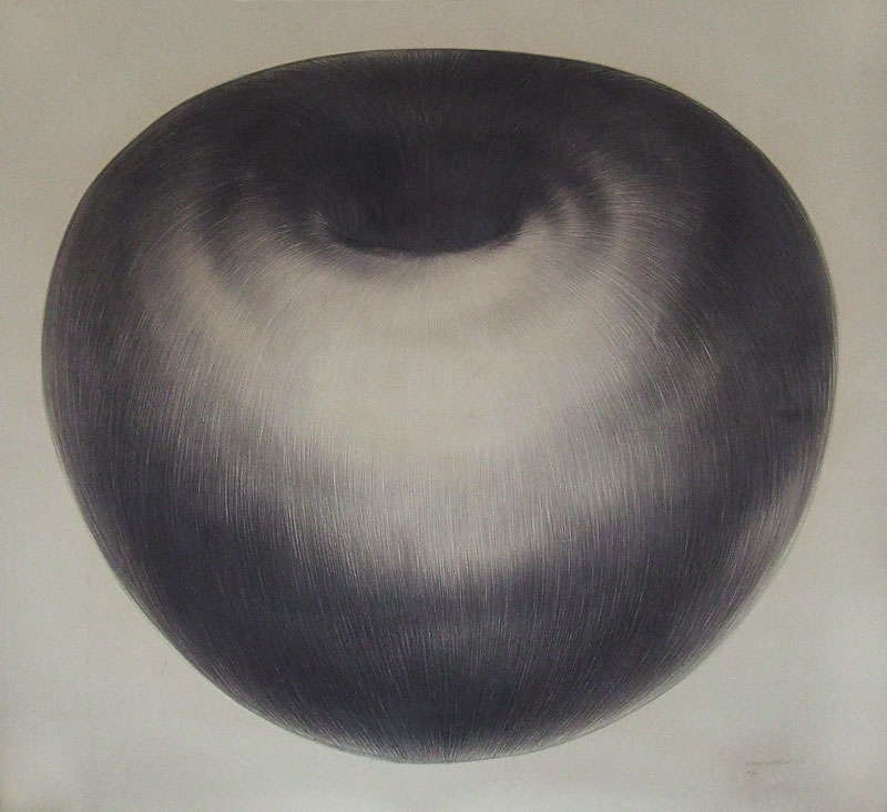
What can I say– I just love book covers, and one of my favorite parts of designing one is having an excuse to trawl around and dig up interesting covers that other people have done (plus a few posters and woodcuts that have slipped in here too).

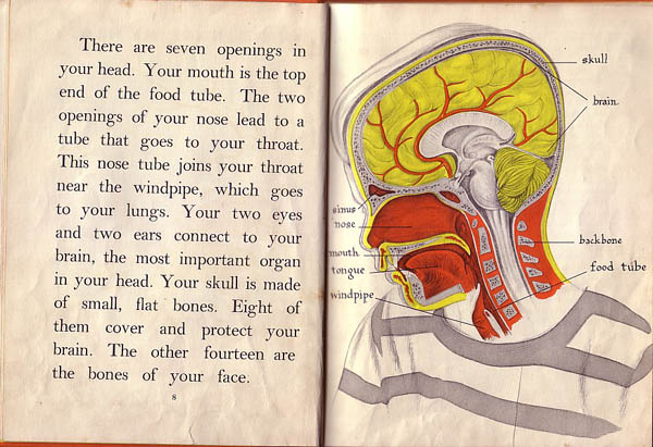
Your mouth is the top end of the food tube.

I continue to labor at the Legs of Izolda Morgan cover, kicking around various ideas. I think it’s safe to say that my wife is tired of being beckoned over to look at new directional sketches. Meanwhile, I’m not sure I’ve ever accumulated so much research for a project that will eventually result in just one single image (well, two, if you count back cover). I’ve certainly done much more extensive digging for larger projects… but this is like reading the amount of material associated with writing a dissertation, only to produce a haiku in the end.

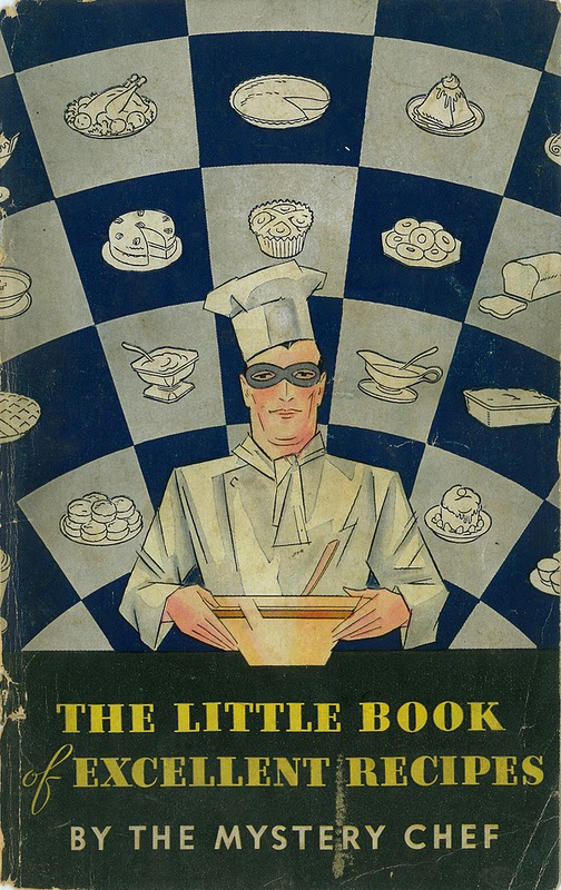
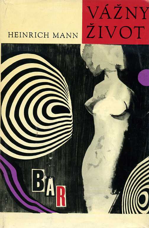
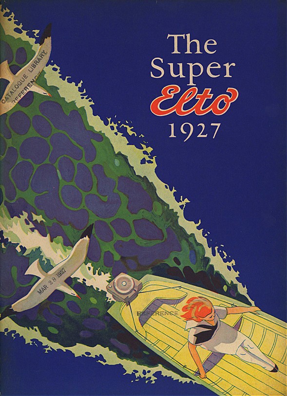
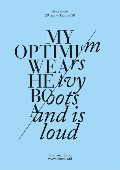
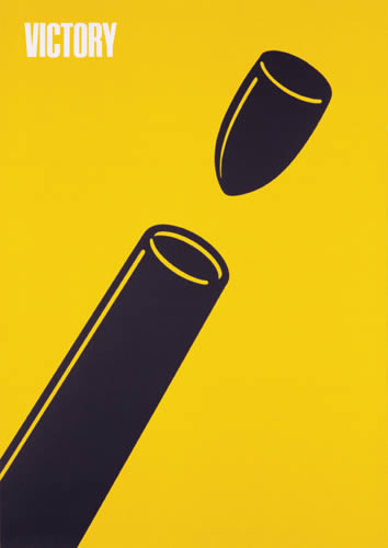
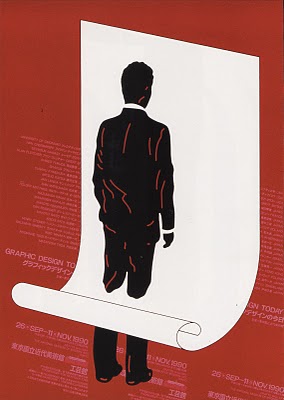
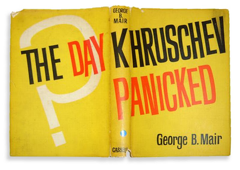
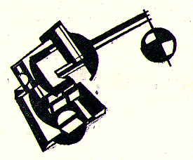
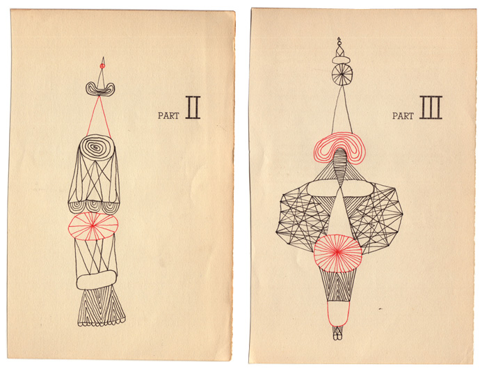
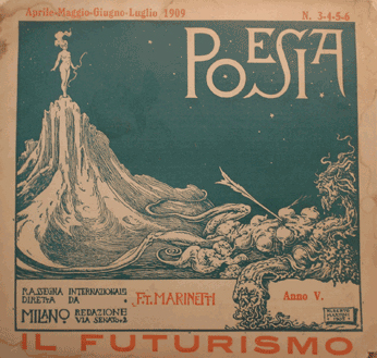
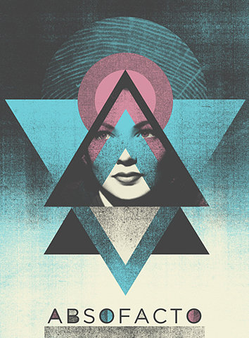
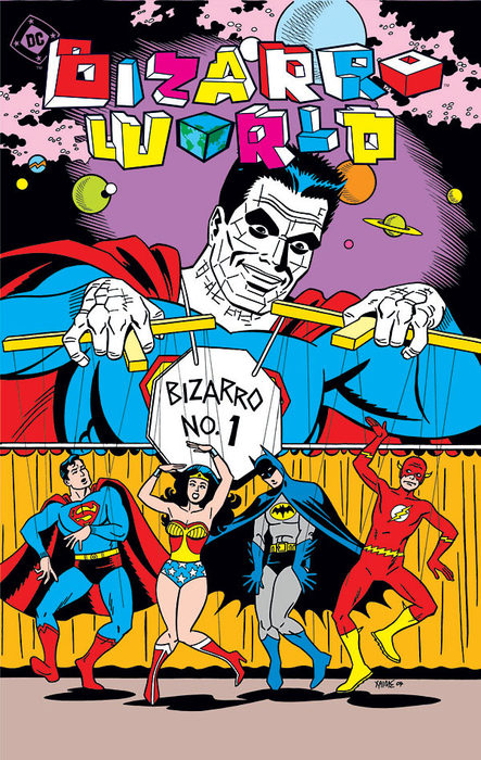
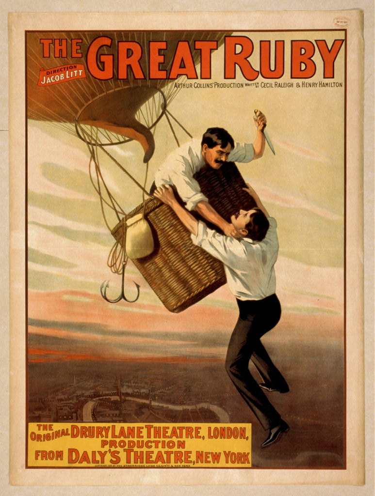
Anyway, since I have book covers and related imagery falling out of my ears, here are a few more recently discovered (or, in some cases, rediscovered) images:

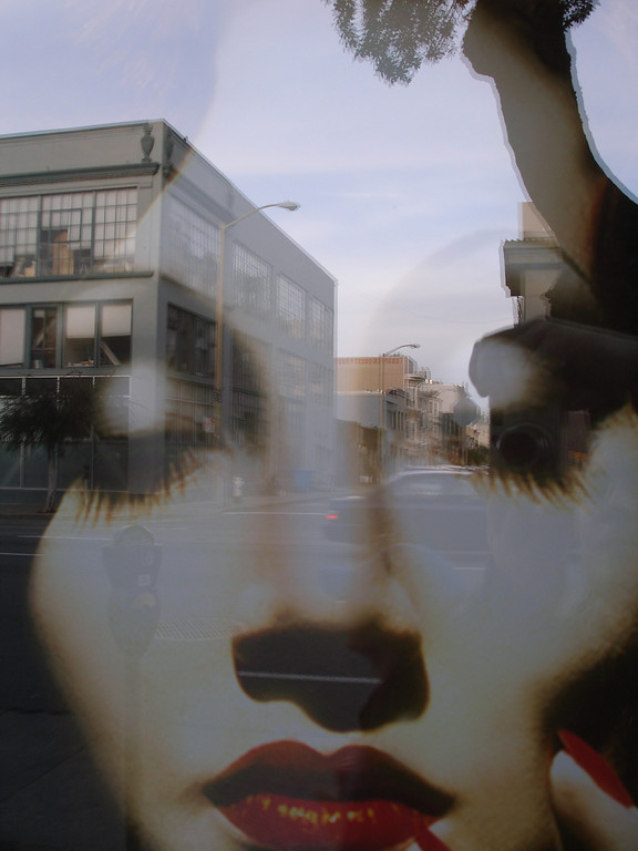
The bottom image here is a photograph by Dallas Sean Hyatt, a San Francisco-based photographer who happened to be having a show at Brainwash cafe that I walked into when I was there in April. I exchanged a few emails with him, told him that I like his work a lot. The above image strikes me as being in the same spirit as the second image on the Right Reasons web site (although his is considerably better for being a raw photograph rather than a jived-up collage).

Brno Bienale and Polish film posters revisited

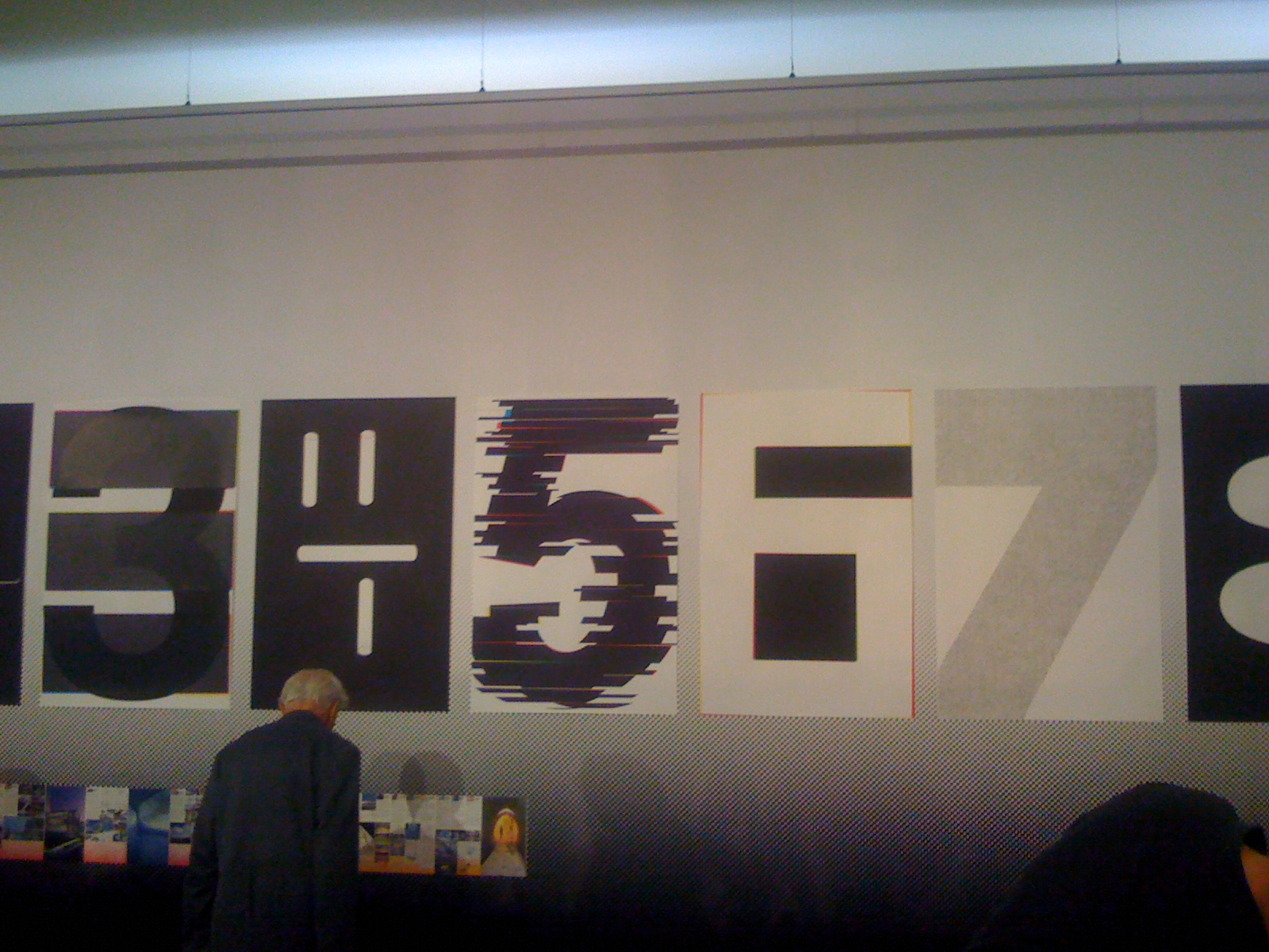
Yesterday, I went to Brno to take part in the opening of the Brno Bienale, a design exhibition in which the CTP book I spent all last summer and fall working on is being displayed. (Note: there are literally hundreds of works being displayed there, so it’s not like this is any great distinction.)

Here’s my trip in handy ascii map format:

(prague)•••••••••••••••••••••••••••••••••••(brno)
|||||||| >>>>>>>>>>(me on train)>>>>>>>>>>>||||||

Assorted highlights along the way:

1. Prague main train station, 10:05am. You gotta love the cafés associated with train stations in Central Europe. It’s just past 10am and I’m drinking a small beer, yet I’m allowed to feel that this is a somewhat upright behavior given that the two guys next to me are pounding shots and smell like they’ve been cleaning out that barn that Hercules had to irrigate for one of his 12 tasks.

2. Brno main train station, 1:15am. Pleasant surprise of the day: getting to Brno and kinda remembering my way around from two previous brief day trips here.

This is a memorable contrast to my first ever trip to Czech Republic, back in 2001 when I was just blowing through on the way to Vienna and had no notion that I’d ever be living here. After staying up most of the night running around Prague, I got on the train to Vienna and instantly fell into a deep, catatonic sleep. After two and a half hours, I suddenly lurched awake when the train stopped, blearily peered out the window into the darkness and was met only with a large, inscrutable sign reading ‘BRNO’. Having never heard of Brno before at that point, I momentarily panicked, imagining perhaps that I had been asleep for twelve hours and had now been carried into some regional outpost on the edge of Siberia. “Oh no! Brrr!” I cried out involuntarily, and then saw the reality mirrored back at me again by the horrifying sign: BRRRR-NO.

3. An exhibit called ‘Uncanny: Surrealism and Graphic Design’, 6:45pm. After the opening ceremony, speeches and awards, and after looking at the main exhibits (all of which turned out to be pretty un-fun for various reasons which I won’t bother getting into… but suffice to say that the part I’m about to describe was the only fun part of the Bienale for me:) I wound up looking through a great exhibit curated by Rick Polynor about the tradition of surrealism in graphic design. Remember those Polish movie posters I blogged about? Czech movie posters from this era were done pretty much in the same style, and this exhibit had fascinating ones from both countries. Check out these various interpretations of Hitchcock’s The Birds:
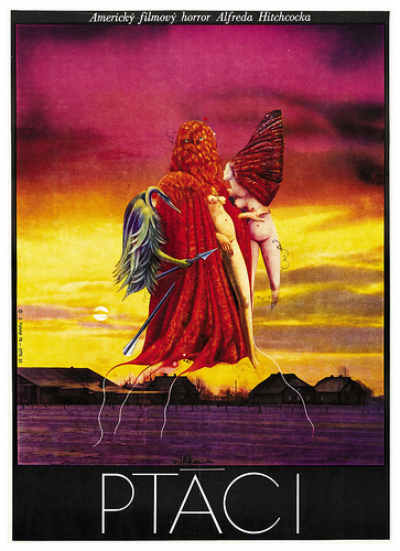
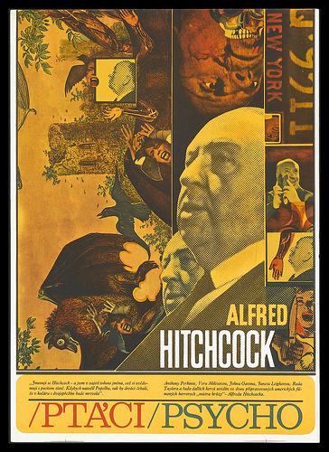
As my Czech student put it while we looking at these, “See… there were some good things about Communism.”

(Note: the top one borrows directly from Max Ernst’s The Robing of The Bride, which I blogged about in the Quiet Visualizations of Evil post.)

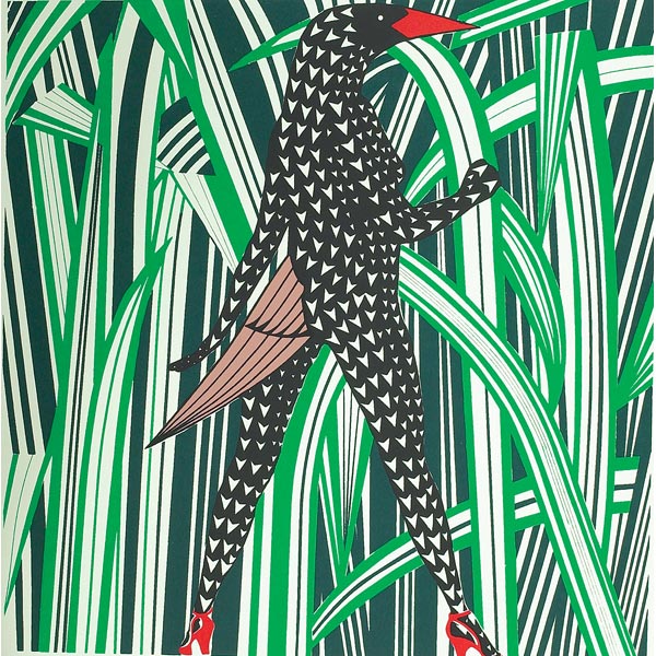
Continuing on the weirdo bird theme, here’s a bird in high heels executed by a 60s Croatian artist that I know nothing about:
For our last bird-related item, check out this incredible 1972 kraut rock cover for Amon Dull’s Carnival In Babylon:

Have you ever seen anything that straddles the line between so-bad-it’s-good versus SO-bad-that-it-swings-all-the-way-back-around-into-bad like this?

Image dump: In search of Izolda Morgan's legs

Some memorable images I’ve run across mostly while researching 1930s Futurist and Constructivist book covers for the Bruno Jasienski project I blogged about last week. Some randoms, too.

(Incidentally, the publisher and I met up earlier this week and we agreed to nix the direction I showed in last week’s post. This decision left me with divided feelings– on on the one hand, I liked that direction aesthetically; on the other hand, it really did feel out-of-step with 1930s Futurism, and the incongruity was really bugging me. Anyway: back to the drawing board).

The Legs of Izolda Morgan

I’ve been working on another freelance book cover project for Twisted Spoon Press, this one another collection of writings by Bruno Jasienski. Jasienski was a leader of the Polish Futurism movement who was deported from France on the basis of his ‘catastophist’ novel I Burn Paris (which I also did a cover for, due out in the fall via Twisted Spoon), and wound up eventually perishing in the gulag of the U.S.S.R. after initially receiving a hero’s welcome there on his arrival.

The most celebrated story in this collection is ‘The Legs of Izolda Morgan’, a delirious tale about a worker who steals his girlfriend’s legs after she’s run over by a tram and sliced in two in the opening lines of the story. The worker basically flips out and decides that machines are out to get us, and strikes back by attempting to sabotage the factory he works in. As a characterization of someone whose sanity seems to have been tainted by contact with the machine age, ‘The Legs of Izolda Morgan’ isn’t exactly as sympathetic as you might expect to technology and modernity as you might expect coming from an avowed Futurist. The story is accompanied (and further obfuscated) by a weird little preface, Exposé, that contains lots of odd provocations and baffling statements, such as this passage that I’m thinking about using on the back cover:

I do not claim that the present book should stand as an example of how the contemporary novel ought to be written. But it is most certainly an example of how the novel cannot be written these days (the joke that you wish to make here, dear reader, only confirms your naivité).

Sometimes, Jasienski doesn’t seem so much a committed ideologue as just somebody who likes stirring up controversy and rattling chains, which I suppose puts him in good company with many other practitioners of Futurism, a movement that was basically founded by a brilliant and subversive clown.

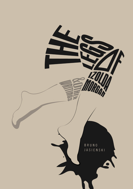
Another story in the collection is called ‘The Nose’, which presents a tempting cover design opportunity in that the cover could be divided in two between nose and legs. However, as ‘Legs’ is the most celebrated story, I’ve inevitably come back around to letting this one be the star of the show. The publisher and I discussed using an all typographic cover, which sort of led me in the direction shown here that I’m currently leaning toward:

The idea would be to print this on a rough recycled paper, to get the same feeling as those great Bukowski publications from Black Sparrow Press. Still very much kicking this one around, though — a few things about it don’t entirely sit well with me. Mainly, it doesn’t  look ‘of its time period’ (e.g. 1930s), which is something I’ve made a conscious effort to achieve with my other Twisted Spoon covers. But maybe that’s a welcome change… ?

Image dump: Alvin Lustig and assorted finds

I’m gearing up for another book cover project for Twisted Spoon Press– this one being a volume of short stories and essays by Jasienski, the same Futurist nutcase who wrote I Burn Paris. In the course of my research, I inevitably come back at some point to Alvin Lustig, a designer whose work you can experience a completely fresh appreciation for every time you take a long look:

A few other favorite recent finds and rediscoveries, while we’re here:

Attributions: 1– Paul Rand, 2– Swiss Werkbund, 3– AisleOne, 4,5– Erik Nietsche, 6– Bradbury Thompson, 7– S.L. Schwartz, 8– Tacoma Library postcard archives

The longhairs of Weimar

Before there was the band Bauhaus, there was the Bauhaus Band:

In the documentary Bauhaus: The Face of the 20th Century, former student Kurt Kranz talks about the school band and student life there:

“The Bauhaus Band was a sort of cross between Dixieland and… let’s say, something partly inspired by Hindemith and his electric piano. When we dared to go out onto the streets– especially the girl weavers who wore trousers– there was always uproar. “Impossible!” people would say. When we came along with ponytails, mothers warned daughters ‘Don’t look! They’re from the Bauhaus!’ We were the punks of Dessau!”

The thing that really interested me about this documentary– which I just showed to my design history students– is the revelation that, along with all the endlessly-touted contributions that the school made to our architecture and interior design ( ‘Our cities it turned into rather mechanical machines, and turned our interiors into rather nice, simplifed kitchen-like instruments’ as one talking head nicely summarizes), it also created a fixture in our social landscape: the ragtag student radical. The basic elements of Kranz vignette– ponytails, androgyny, spontaneous happenings and pranks, horrified middle-class on-lookers– all sound like staples of the early 60s, but the microcosm Kranz describes happened 30 years earlier.

In a culturally chauvinistic way, I tend to assume that there was something genteel and restrained about college life the world over until the early 60s when – poof! – the student radical suddenly emerges on the American college campus on the strength of demographic factors, post-war prosperity, the social protest movements of the 60s and everything else. But, in a ‘winners write the history books’-type way, I tend to forget that the atmosphere in Germany between the wars was more politically galvanizing than anything the U.S. has ever experienced– I mean, you had a short-lived communist coup AND a fascist takeover within 14 years, and all centered around the city of Weimar where the first incarnation of the school was headquartered. Plus, the Bauhaus preached all the the free-thinking ideas– question everything, knock down gender roles, etc– that we associate with the liberal campus environment.

There’s also a nice bit about Johannes Itten, the mysterious instructor who taught a foundation course that hugely shaped the spirit of the school for its entire lifespan. You always read about Itten being a bit of a weirdo, but I hadn’t realized that he was a full-blown mystic who opened classes with chanting and dabbled in Zoroastrianism:

World’s oldest religion, baby!

Also, there’s an interesting discussion of the Nazis’ contradictory attitudes to avant-garde design– onthe one hand, they persecuted the Bauhaus teachers and students and promoted a pretentiously rusticated style of furniture design. But this opposition was mainly for show– the director briefly summons an entertaining photo of Hitler lounging in a tubular steel chair as evidence of their basic hypocrisy:

The printing press: pain in the ass, now as it was then

On Monday night, veteran newspaper and magazine man David Wadmore did a guest lecture at Prague College, the second of his highly entertaining talks that I’ve managed to catch. Wadmore has been designing for newsprint and periodicals for so long that some of his reveries about the old days remind me of those sepia-toned segments in the Simpsons where Monty Burns recalls his youth. Ah, the Lord Stanhope Press… she ran on steam!

For almost the first five and half centuries of its existence, the printing press barely changed at all, which is pretty amazing when you consider that it was probably the most significant invention of its millenium and landed Johannes Gutenberg at the #1 spot in A&E’s goofball ‘People of the Millennium‘ countdown. Personally, I was a little disappointed that the other Gutenberg– Steve– didn’t make the list as well somewhere– I mean, four Police Academy movies? Get out. Meanwhile, how about being Bill Gates (#41, the highest-rated alive person) and knowing that you sit a few spots above William the Conqueror and Machiavelli? That’s gotta feel good. On the other hand, imagine James Joyce watching from heaven as he’s dropped one spot behind Ronald Reagan.

Getting back to the point: in the 1880s, the cartel of New York newspapers were offering an open reward of a cool million dollars to anybody who could speed up type-setting production by 25-30%. Having done some type-setting by hand as a nerdy enterprise, I literally find it hard to even wrap my head around the idea of a daily newspaper being set by hand– it makes me slightly nauseated to think of the constant frantic whirl of human activity that this entailed. A German named Otto Merganthaler delivered humankind from this bondage with his invention of the linotype machine, a wild contraption of a thing that looks like this:

Person sits on stool, taps on typewriter; meanwhile, sinister spindly arms up top slide corresponding negative-impression letters, numbers and characters onto a tray to form a line onto which hot lead is poured, producing a line of type (‘line o’ type‘). Newspaper production is sped up, newspapers can afford to sell copies for slightly less, news-literate public grows widely, whole system flourishes until a combination of Roger Ailes and the internet conspire to squash it like a bug.

What’s easy to forget– unless you’re reminded by a handy guest lecture– is what a pain printing then remained for the next hundred years. Wadmore had a great account of how the simple process of reversing out a box of type (that is, printing white on a black box) required something like seven people, in part due to the insane union regulations that essentially forbade anyone from physically giving anything to anyone else and instead demanded that a messenger be used as a conduit. My old typography teacher used to create the impression that the phototype and early pseudo-computer processes that came along right before desktop publishing were almost more thankless than handsetting type, in the sense that they involved a lot of the same inconvenience but also took you away from the ameliorating rustic pleasures of handling type by hand and instead replaced it by peering into monitors that were attached to computers with no undo function:

(Photo credit: Flick user Alki1)

After his first Prague College lecture, Wadmore opened things up to Q&A– I immediately asked him something designed to get him to tell us about the most hair-raising screw-ups and blunders that he experienced in his many years on the job. He diverted the question slightly but came up with a great response: the night that Lady Di (someone who also inexplicably appears on the ‘Top People of the Milennium’ list, by the way) died, the entire press corps of London happened to be at a uproarious wedding of some high-ranking colleague. So, in the wee hours of the morning, they were woken up one by one by their respective papers and ordered to get to Paris on the first possible plane. So: the next time you see re-run news coverage of her death, stop for a moment to appreciate the collective hangover of the press covering the event, and their unsung heroism in soldiering forward with the story.