Illustrated Victorian Fortune Cookies

A few weeks ago, former guest-blogger Grandjoe wrote me with the following evocative request:

I wonder if you could help me identify a print that I saw in Sarah’s classroom, on “Grandparents and Special Friends day.”  Though not knowing either the artist or the title of the picture, I don’t see how it could be tracked down.

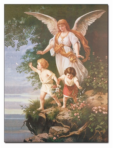
At first glance, I didn’t pay much attention to it.  A somewhat kitschy idealization of childhood, late 19th century, probably English or American.  A brother and sister gamboling  in a meadow, being watched over by a guardian angel who is behind them.  (She’s ethereal without having wings.)  But  on second glance, a sinister subtext  suggests itself. The meadow is on the verge of a cliff .  A lovely flower grows at the edge if the cliff, the  blossom drooping over into space.  The direction of the boy’s gambol is  such that he might easily be attracted by this enticing flower.  Similarly, the girl might catch sight of a white butterfly that is fluttering towards the brink.  The viewer’s apprehension would be allayed by the presence of the angel, if she were not gazing off to the side, not directly at them, apparently lost in a a vision of celestial bliss.  It’s not at all clear that she would get to them in time.

For me, the picture documents the dread that must have constantly assailed parents at a time when medicine was helpless to save children from premature death.  No doubt parents are still anxious, but nowadays the threat is not so dreadful that it has to be hidden, as in this picture, behind kitschy denials of reality.

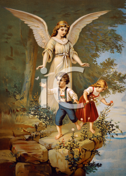
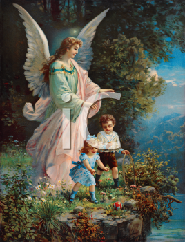
It turns out that this tableaux describes not one but probably hundreds of prints from the Victorian era. It seems that ‘child in close proximity to cliff while Guardian Angel observes from a short distance behind’ had a similar cultural currency in those days as Lamborghini or Che Guevara posters did in my childhood. Witness variations on a theme:

You get the idea. What’s interesting (sort of) is the sameness of pose and dramatic framing from image to image. If you imagine an urgency scale of 1 to 10 where 1 equals no problem, you’re just hanging out in a field… plus you’ve got a guardian angel behind you and 10 equals you’re toast. you’ve fallen over the edge and not even your guardian angel can save you, these images all seem to clock in at about 7 or 8. As evidence, note the general serenity of Angel’s expression but the similar outstretched reach in almost every instance.

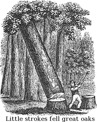
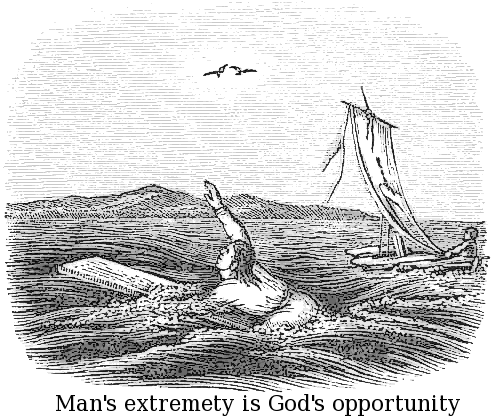
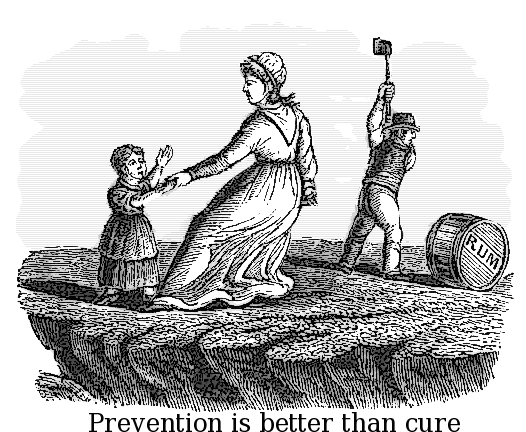
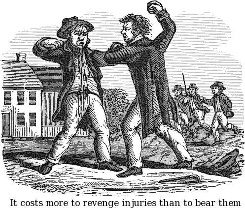
But the best find from all of this turned out to be a fairly unrelated set of illustrated proverbs I found from the same period. It’s interesting to view mass media from a time before the all-consuming hobgoblin of irony entered the picture. Back then, you could simply place a moralistic statement under a drawing illustrating the same principle and call it a day. Nowadays, promising writers drive themselves up the wall trying to deal with the problem of what we really mean and what we don’t.

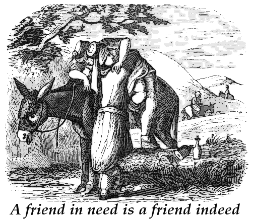
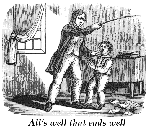
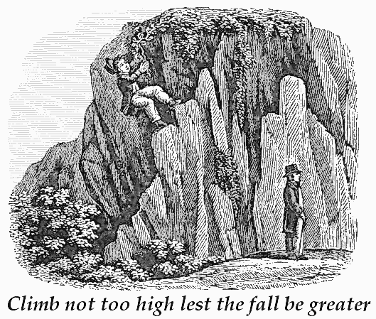
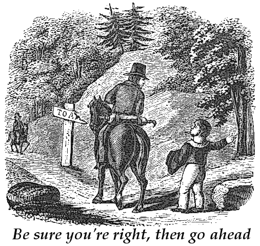
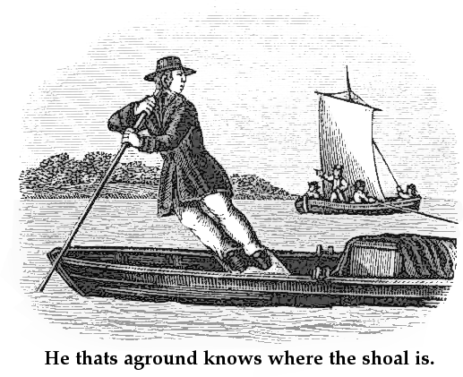
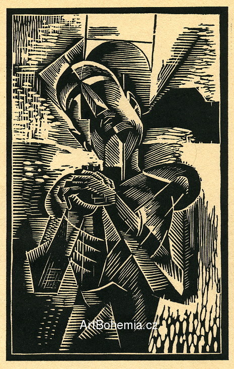
Here’s a sampling of these proverb woodcuts I came across, presented with a ranking from 1-10 regarding their relevance to modern life:

8.0. Relevant. My friend even used this phrase not too long ago when I asked him if I could crash on his sofa.

5.o. Gets points for the fact that this phrase maintains tenuous cultural currency. But nothing here seems to be trending towards a good end. I feel like I’m lacking some context.

3.5. Good point… but the unintentionally humorous illustration makes this feel like something out of the Gashlycrumb Tinies.

9.5. Timeless wisdom. Applies to both Prince William and Barack Obama.

1.5. Sounds persuasive, but what’s a shoal?

7.5. Same take-way as Bob Marley’s ‘Small Axe’. Thumbs up for continuity!

1.0. As a secularist, I say extremity sucks. At least I can spell it correctly.

3.0 Who’s preventing whom from what cure now?

6.0 I’m not sure I get the point, but that’s some damn good donnybrooking there.

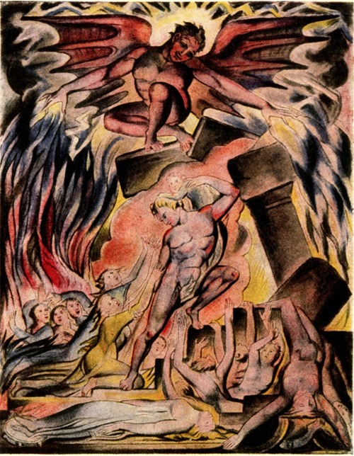
(Top image: kickass William Blake illustration. Not Victorian… and nothing to do with anything else in the post… but when would I ever get a pretext to post this again?)

Making Ends Meet

Just read a good article in the October 4th edition of the New Yorker about John Cage. There’s a brief discussion of a period of great austerity– he rented a small cottage for years and lived barely above the poverty line– which the composer finally emerges from not thanks to music but rather because he had become one of the world’s foremost experts on… mushrooms, of all things. There was even a series of appearances on an Italian TV quiz show that culminated in Cage listing sixty-four specific types of mushrooms in precise alphabetical order to win prize money that allowed him to buy a van. (For a glimpse of Cage’s TV persona, see this clip of him on the American show I’ve Got A Secret. No mushrooms, but interesting banter and a great performance of Water Walk).

Cage’s mycology doubtlessly belongs in the shortlist of great unlikely jobs taken on by creative geniuses in order to make ends meet. My favorite such example  is David Lynch: approaching 30 years of age and struggling to finish Eraserhead, the director supports himself and his family by working a paper route at nights. The example that’s always made me feel the worst is Nick Drake‘s sad notion towards the end of his life that he’s going to study computer programming. The idea of someone with Drake’s clueless sensitivity developing such a misguided idea about how to make his way always strikes me as an example of how cruel the world can be. I think I’d hire one of the Amish to program mainframe computers in 1972 before I would hire Drake, if forced to choose.

Good Times, 1660s Style

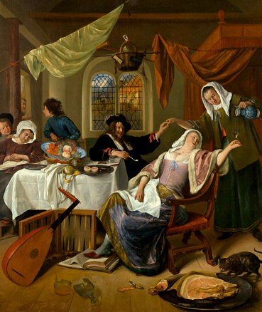
I offer this painting as a response to Dan’s recent “Good Times” post, to suggest that not a lot of progress has been made in invoking dissolute good times in the last 350 years. Here’s a blurb I found describing this painting by the Dutch painter Jan Steen, “The Dissolute Household.” The best part is that Steen used himself, his wife, his sons, and even his mother as the models for the figures.

This painting depicts a “Jan Steen household,” a standard by which all later family dysfunction may be measured. The lady of the house tramples a Bible while having her wineglass refilled. Her husband and the maid join hands in a gesture suggesting service beyond the call of duty. The boy in blue fends off a beggar at the door, thus recalling the Parable of the Rich Man and Lazarus (Luke 16:19–31), in which the more fortunate figure goes to hell. Fate hangs over the family’s head in the form of a basket holding a sword and switch (signifying justice and punishment), a crutch and can (forecasting poverty), and a wooden clapper (used by lepers and the plague-stricken). In this (sixteen-) sixties sitcom, Steen himself stars as the father, his wife Margriet van Goyen as mom, and their sons Thaddeus and (next to grandma) Cornelis as themselves.

Top that, Cointreau ad agency!

Concrete Serengeti

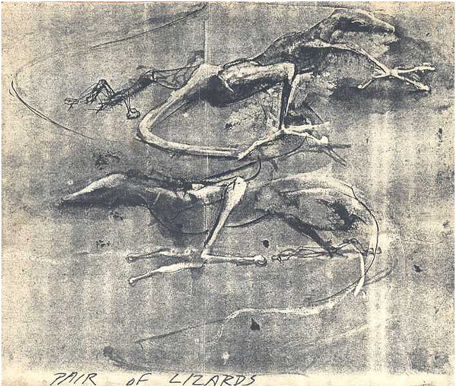
A few nights ago, something inspired me to google the name of a sorely-missed friend of mine who’s been dead for 10 years, a guy named Joe Schactman. Joe was a serious artist and a big influence on my decision to get into graphic design– hell, when we first met, he was about the only person who could tell me anything about graphic design. The nascent internet sure didn’t have much to say, and you couldn’t find anything of note at the public library. I keep a photo on my desk of him sitting in our backyard, focussedly whittling away on a tiny bit sculpture in his hands– Joe was always working on something, so I try to leverage my memory of his industriousness to remind myself to stop procrastinating and get back to work.

Fortunately, the internet has come along way in the last decade, so my google search of two nights ago led me right away to the Flickr page of another old friend of his who has posted this Schactman drawing ‘PAIR OF LIZARDS’:

One fun thing that Joe would talk about from time to time was the various bizarre live-work spaces that he inhabited as a rag-tag artist in New York City in the late 70s and early 80s. One place, in particular, that he lived in was a giant abandoned factory building somewhere in (if I recall correctly) Williamsburg. Space was rented out for a song to artists, who had all the room they could possibly need there, but the problem was that the place was so vast that you couldn’t realistically heat it in wintertime. So, everyone who lived there would make some kind of teepee-like structure, a tiny sub-unit that they could sleep in and afford to heat. The overall effect, as Joe described to me, was like living in the Serengeti, except you’re also in a giant factory building. In the morning, you would creep out of your tent and start making coffee outside, and then gaze across the vast cement expanse to watch another groggy nomad emerging from his or her tent as well at some great distance. Perhaps friendly salutations would be exchanged or (I like to imagine) some hostile fist-shaking if neighborly relations were momentarily strained. This idea of recreating these kind of primitive tribal patterns within a giant cement enclosure entertains me to no end.

Image dump: In search of Izolda Morgan's legs

Some memorable images I’ve run across mostly while researching 1930s Futurist and Constructivist book covers for the Bruno Jasienski project I blogged about last week. Some randoms, too.

(Incidentally, the publisher and I met up earlier this week and we agreed to nix the direction I showed in last week’s post. This decision left me with divided feelings– on on the one hand, I liked that direction aesthetically; on the other hand, it really did feel out-of-step with 1930s Futurism, and the incongruity was really bugging me. Anyway: back to the drawing board).

Something about Andy Warhol

These are two very well-written paragraphs, in my opinion:

“The essence of Warhol’s genius was to eliminate the one aspect of a thing without which that thing would, to conventional ways of thinking, cease to be itself, and then to see what happened. He made movies of objects that never moved and used actors who could not act, and he made art that did not look like art. He wrote a novel without doing any writing. He had his mother sign his work, and he sent an actor, Allen Midgette, to impersonate him on a lecture tour (and, for a while, Midgette got away with it). He had other people make his paintings.

And he demonstrated, almost every time he did this, that it didn’t make any difference. His Brillo boxes were received as art, and his eight-hour movie of the Empire State Building was received as a movie. The people who saw someone pretending to be Andy Warhol believed that they had seen Andy Warhol. (“Andy helped me see into fame and through it,” Midgette later said.) The works that his mother signed and that other people made were sold as Warhols. And what he made up in interviews was quoted by critics to explain his intentions. Warhol wasn’t hiding anything, and he wasn’t out to trick anyone. He was only changing one basic rule, the most basic rule, of the game. He found that people just kept on playing.”

This is from Louis Menand’s article in last month’s New Yorker (subscription required), which also does a nice job taking on the annoying conceit that Pop Art was an entirely American idea. As I drone on about at length in my history lectures, the U.S. was a pathetic nowhere in terms of creating abstract visual ideas until a herd of Bauhaus-era designers and artists came flooding over from Europe during World War II. Rothko? Russian. De Kooning? Dutch. Gorky? Armenian. DuChamp? Not a chance. Maholy-Nagy? No way. Mondrian? I won’t even dignify that with a response. And so on. If Pop Art needed American consumerism to supply its subject matter, it also apparently needed a foreign observer to make sense of it.

This brings us to the subject of Warhol’s ancestry, which confused the hell out of me for a long time. In the U.S., you generally hear him referred to as Polish. But once I started teaching at Prague College, however, my Slovak students were quick to inform me that he’s actually Slovak– and indeed he was born in an area that now belongs to Slovakia. But, it turns out that his family was in fact Ruthenian– the Ruthenians being a teeny distinct Slavic people whose homeland was absorbed by what are now Slovakia, Belarus, Ukraine and Russia. So here’s to you, Ruthenia– today I salute you. I like to imagine that when you did still exist, you were a fine destination to hit for a bit of the old orientalism.

On a personal note: back in the 50s, my grandmother was an account manager with Ogilvy (something I think about a lot as I watch Mad Men, as it’s fair to presume that she probably faced a lot of the same institutionalized hurdles and general BS that Peggy faces in the show, and was probably kind of a cool, ahead-of-her-time lady). Anyway, she apparently knew Warhol back when he was a commercial artist and bought some of his sketches back then, which now must be worth a fortune. I wouldn’t know, because they were somehow stolen from her home in a manner that no one can exactly pinpoint (probably happened during a brief point when she was renting her house). So, that stinks.

Reader mailbag: Anatomical drawings and how to hold your breath for 17 minutes

In the ‘Lifestyles of the undead’ post below, I know-it-all-ishly implied that nobody’s yet done a modern update/parody of the those anatomical drawings where the subject is obligingly peeling off his or her own flesh. It turns out that my friend SP has done exactly this: “I wanted to show you the homage I drew to those weird anatomical illustrations where the women are serenely peeling back the flaps of their muscle layers,” she writes. “Life size, done while at SFAI, actually 2 layers on vellum, when you lift it it’s the fetus /womb underneath.”

Behold:

—–

Meanwhile, reader JO brings to our attention this harrowing clip of magician David Blaine discussing the tricks of his trade:

The clip is primarily Blaine talking about his efforts to hold his breath for a world record 17 minutes while battling horrible convulsions and symptoms of cardiac arrest. But along the way, he also comments on a few other lively exploits including:

– Being buried alive in a coffin for a week

– Being frozen in a block of ice for 3 days

– Standing on a narrow 100 foot pillar for 36 hours

– Living in a glass box for 44 days while antagonistic members of the British press helicopter cheeseburgers around the box to tempt you

I think I nearly slid into shock just listening to this stuff. It’s amazing to think while listening to Blaine talk about hardcore training sessions in hypoxic tents that he nominally shares the title of ‘magician’ with guys like this:

It’s something like when you watch a tiny little dog sniff the butt of a great big dog 25 times its size– yeah, they’re both ‘dogs’, but they hardly seem to belong to the same species. Or, like comparing my friend who plays in the occasional badminton tournament compared to that nutcase Swedish guy who tried to ride his bicycle to Mt. Everest from Sweden and then climb the mountain– they’re both doing ‘sports’ in a loose definition of the term, but there’s a world of difference between the two. Blaine’s particular brand of magic is to removed from the traditional trappings of wands and top hats that it really does seem like something else altogether– a kind of endurance testing. But, he did come up worshipping Houdini and wriggling out of handcuffs and whatnot, so I guess that in his mind it all seems like an extension of the same thing.

Lifestyles of the undead

One of my dissertation students turned in a nice paper on the role of graphic design in the health care industry, which was a good choice of topic. It also allowed  for a brief and compelling glimpse into the history of anatomical drawing in the 16th and 17th centuries, a genre that manages to be awesomely whimsical and morbidly realistic by turns. Some of this stuff I’d run across before (usually in the context of samples of copperplate engraving), other examples were totally new to me.

These are culled from both her dissertation and my design history lectures:

Juan Valverde de Amusco, Anatomia Del Corpo Humano. A cadaver gallantly cuts off his own skin to show us the musculature underneath. The anatomical artists of this period liked to show their subjects engaged in goofy, fanciful activities in order to demonstrate a particular angle or aspect of the body.

Andreas Vesalius, De Humani Corporis Fabrica. A great spread, in which the skeleton on the left appears to mull over human mortality while the one on the right seems to be having a full-blown weeping fit. It’s a wonder nobody has yet produced a modern satire/update of this where skeletons are shown in various poses of hipster malaise, tapping on their iPads and naming their children Atticus and Rimbaud.

My favorite from De Humani Corporis Fabrica. One annotation I found claimed that this pose references an expression that saints and Jesus were often shown in, looking upwards to heaven. Whatever. With the spade and Idaho-like surroundings, it really looks to me like an exasperated  ‘Aaaagh, fer cryin’ out loud!‘ gesture. I just love it.

Ok, that was fun. Now for some more gruesome stuff…

Again from De Humani Corporis Fabrica. This time, our lanky friend has been hanged from a rope in order to reveal his esophagus. The thing that looks like a manta ray stuck on the wall to his right? Good news: that’s his abdominal diaphragm, fully removed from his body.

Govard Bidloo, Ontleding Des Menschelyken Lichaams. Hands with disconnected flowing tendons and feet with horrible pokey things stuck through them. I guess you couldn’t properly grasp anatomy without these flourishes? Let’s hope so…

William Hunter, Anatomy of the Human Gravid Uterus. Whoa.

Just to end the post on a more upbeat note…

Fritz Kahn, Der Mensch als Industrieplast (Man as the Industrial Palace). Poster from 1926 visualizing the human digestive system as a chemical factory. Unlike De Humani Corporis Fabrica, this one did get an awesome modern update treatment by Fernando Vicente: