Last night, I met with the publisher to show my second round of cover ideas for Bruno Jasienski’s The Legs of Izolda Morgan. After the debacle of the first rejected round of ideas, imagine my relief when the publisher basically said, “I like them all… I can’t decide.” He wound up handing them over to his wife, who— without any hints from me—independently picked the same one that I was leaning towards as her favorite. So, that settled it.
See if you can guess which one was the winner. None of these are presented as ‘finished’– the idea is to go as far as you need to to demonstrate concept and then move on to the next idea– so they’re in various states of haggardness in terms of missing details. The beige background color is meant to be a loose approximation of the rough, uncoated off-white paper we’re talking about printing it on.
Since it’s boring to just number or letter them, I’ll name them after various members of Fleetwood Mac…
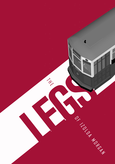
Stevie Nicks direction:
Peter Green direction:
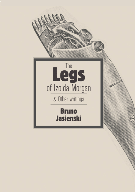
Bob Welch direction:
Mick Fleetwood direction:
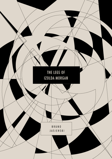
John McVie direction:
Christine McVie direction:
Lindsey Buckingham direction:
And, just for posterity’s sake, here’s the main rejected design from round 1:
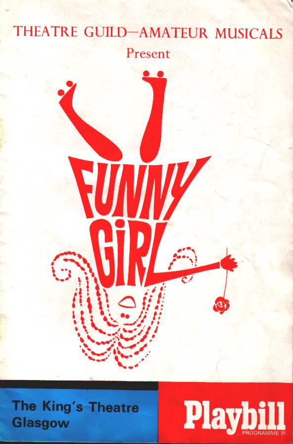
While I’m generally OK with not using this direction, what really galls me about its rejection is the fact that the publisher kept getting stuck on its resemblance to this stupid poster for the Barbara Striesand movie Funny Girl:
Damn you, Barbara Streisand.
Anyway, I’m happy with the direction that we wound up picking, and relieved to finally be able to move past the sketch stage. What do you think?


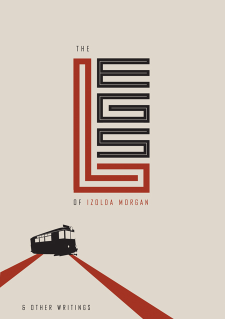
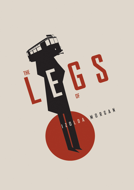
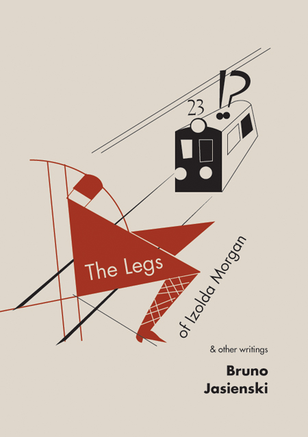
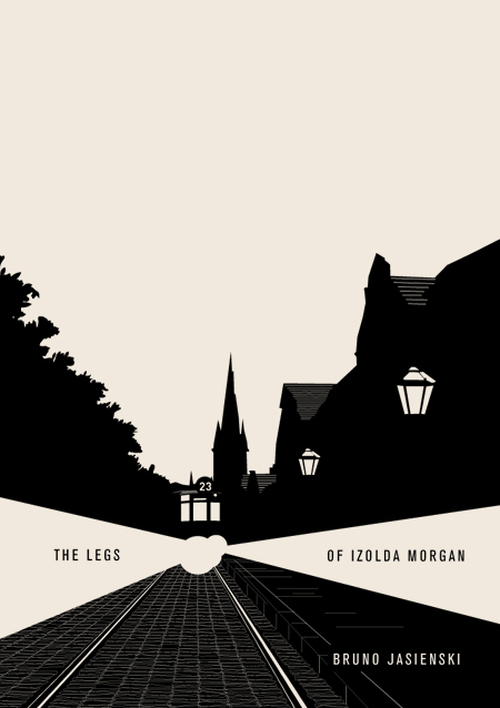
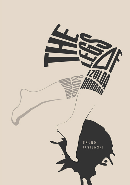
First, I like them all too! I gave my vote to Lindsey Buckingham only by a fraction. My second choice was probably Christine McVie followed by Welch.
Second, that is cold, comparing your initially preferred design to the Funny Girl poster.
Congratulations on the closure!
As you’re the only person to vote so far, that gives Lindsey a solid 100% lead. Feel the power! And thanks for your continued input.
S. Nicks. I love the type technique. but the streetcar looks lost in the corner.
P.Green. Hmmm not my fav. I like the idea of the streetcar as the idea in ones head.
Bob: The one voted for. Love the simplicity. Just I do not think they would have picked it.
MIck is very strong also. Has a nice eerie feeling to it.
Mr. McVie is great. I like the MIro meets Mondrian feel of it.
Mrs. McVie. probably my least favourite of the lot.
NIce work. Hope to see which one we will see in the shops.
Like the publisher, I like them all.
Steve Nicks is the most eye-catching; it really grabs me. But then I think: I already knew the title before I saw the cover. Would someone who didn’t be baffled by the typography? Safer to settle on McVie. But I’m not sure how you’re going to add to McVie the author’s name and “& other stories.” You’ve pretty well solved that problem on Steve Nicks, so Nicks is my first choice.
Mick Fleetwood wants to tells a story. But it barely beat out Mr McVie, and Bob – who doesn’t like an interrobang‽
Speaking of which, I think the failure of the interrobang to catch on is largely due to how heavy it looks. I’ve seen a version with the ! leaning left and the ? out to the right – giving them room makes it much more appealing.
Tram head on with the left/right beams.
I just voted and I hope I’m not spoiling this for anyone, but EACH COVER now has 14.3% of the vote. CLOSE RACE!!!
I should have put the cover of Supertramp’s Breakfast In America and a photo of a week-old sandwich in there as well, just to see if they also got an equal share of the voting.
Yeah, or The Who Sell Out!
I’m surprised there hasn’t yet been an American Idol-esque flurry of ballot box stuffing!
Poor interrobang. I like to think that glyphs somehow need to retain a tie to handwriting– specifically to strokes that are natural to the wrist and hand. If you mime making an interrobang, it feels awkward– the overlapping vertical strokes are too close together, so your wrist feels kind of cramped. That’s my nerdsome explanation for its failure to catch on, that it violates the subliminal architecture of handwriting.
Can I retroactively vote for the week-old sandwich?
GO WEEK-OLD SANDWICH GO!!!!!