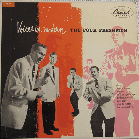
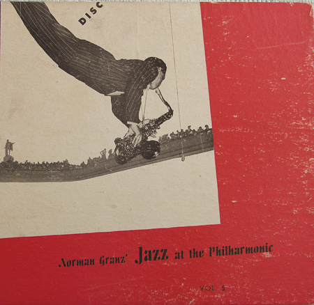
The first two posts covered the illustration-based covers; these next two posts show the ones designed around photos.
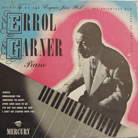
In this batch, I especially love the irradiated glow around Errol Gardner, and the Victorian-era swashes around his initials. I suppose the latter design idea probably stemmed from the fact that he happens to have a dashing Anglocentric name, and that they wouldn’t have thought to add this effect for, say, a Thelonious Monk record.
Also: it occurs to me that I’ve been an ignoramus in terms of presenting these as being all ’78’s’ in the last two posts– some of them are 45s or LPs and clearly say so right on the cover. So, nevermind about that part…

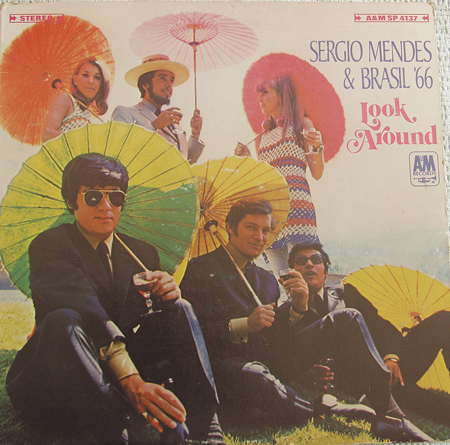
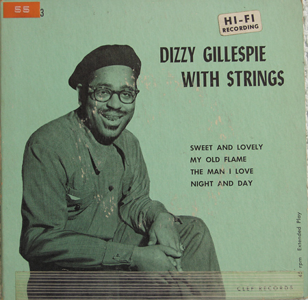
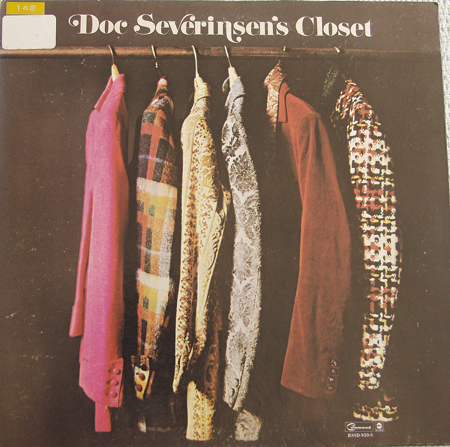
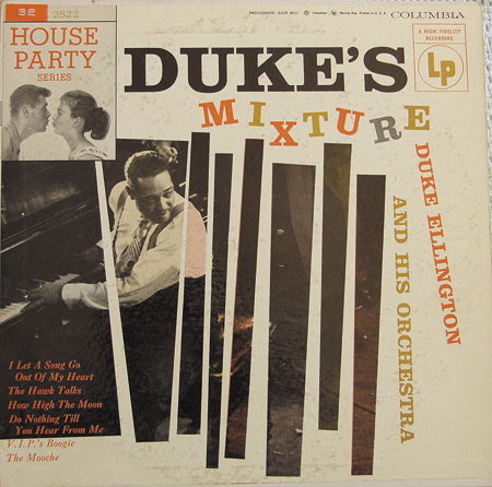
Yeah, they don’t make em like they used to!